
Note: This article was filed by a paid contributor to Xerox Corporation.
Did you know that something as small as the color you use for your logo, web designs, or even font can make or break how people perceive your company?
Known as “color psychology,” there is science that reveals how certain colors can affect the way people behave and respond to external stimuli. In this case, your marketing collateral, website, company branding, and communications may be perceived in a manner that was unintended solely based on the color choices you make.
In this article, we are going to explore the known effects color has on consumers as well as what color psychology says about specific color choices in marketing.
Color and User Behavior: What the Research Says
Color is a surprisingly powerful element in marketing, even when used in very small doses. It can lead website visitors to notice a special offer they might not have otherwise been aware of. It can inspire passersby to pick up one particular flyer among a sea of other flyers. It can even improve readability and clarify your marketing message if used in the right places.
Want to know what else color can do to improve how consumers perceive your brand? Here is what the research says:
-
Source: 20 Ways to Share Color Knowledge 80% of people more easily remember the details of a brand when color is present.
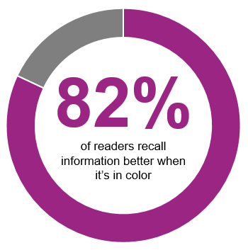
- 82% of readers recall information better.
- 73% understand a message, product, or general piece of information better.
- Color can be used to guide readers to important information 70% faster than if they tried to find it on their own.
- Color is 39% more memorable than black-and-white content.
- 55% of people are more inclined to look at colorful marketing collateral before anything else.
- Color can increase conversion rates by 80%.
While color can be a powerful force in marketing, it is not as simple as using color in your designs. Color has to be used strategically, which means it needs to complement your brand’s style guide and pre-defined color palette. It also means that color “signals” need to communicate the right behavior or direction for your readers to follow.
The Meaning Behind Color
Although there are hundreds of colors you could realistically experiment with, it is best to focus on the underlying message behind the standard color palette. Shades and gradients will come into play later, but you first need to get your messaging right before you can start to experiment with your choice of color.
So, here is the meaning behind the most popularly used colors in marketing and branding:
- Blue: trustworthy, reliable, traditional
- Green: natural, peaceful, growth
- Yellow: positivity, happiness
- Orange: energetic, fun
- Red: urgency, warmth, danger
- Purple: sophistication
- Brown: calm, stability, conservative
- Black: luxurious, valuable
- White: purity, peace
Something you should know about choosing colors: it is not just about aligning your color choices with your brand and choosing colors known to trigger certain responses from readers. There are other factors that come into play, like:
- Contrast – How color contrasts with its surroundings, especially if it affects readability.
- Brightness – The level of brightness or darkness can change the meaning as in the case of red where one end of the spectrum means danger and the other warmth.
- Gender – According to one survey, there are certain colors men and women, as a collective whole, can’t stand, so if your audience leans heavily in one direction, you will want to pay attention to this.
- Geography – Take the color white, for instance. In most Western cultures, it represents peace and purity. However, in some Asian cultures, white is used for mourning and misfortune.
 It is incredibly important to think through your choice of color by thoroughly considering how it may be perceived from all sides.
It is also critical to have the right printer in place to ensure that the physical output of your marketing collateral does not negatively affect those smart color choices you have made. Xerox has a number of high-quality printer solutions that will get the job done. For smaller teams and production needs, the WorkCentre 6027 multifunction printer is a good choice. And for larger scale projects, you could use the WorkCentre 6515 Color LED All-in-One Printer.
Want more tips on how to boost your branding and marketing efforts with color? Read Give Your Business Brand a Boost with More Color.
Share this article on Twitter!
Tweet: How to Choose Color Wisely to Boost Your Business Marketing https://ctt.ec/iewXp+ via @RamonRay
Subscribe to the Small Business Solutions Blog and receive updates when we publish a new article. [wysija_form id=”1″]