 Even with simple tools – adding capabilities often means adding complexity. A screw driver versus a Leatherman tool. A TV remote control versus a universal remote. A dumb phone versus a smartphone. And yes, a printer versus a multifunction printer (MFP).
The design of the user interface (UI) must support the capabilities offered by the product. For printers, the requirements are pretty simple. The UI offers access to reports, printer settings and potentially access to saved or secure print jobs. This can be accomplished with a few buttons and a 2-line display.
Compare that to the MFP version of the same printer. Now, supporting the same capabilities as the printer, but adding copy, scan, fax, email – a slightly larger display and many more buttons are required. We make this expanded user interface intuitive, but it is undoubtedly more complex.
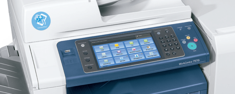
Smartphone adoption has skyrocketed, bringing with it icon-based interfaces for launching apps and accessing capabilities. We now see a wider-range of devices taking advantage of this kind of intuitive interface design. With the WorkCentre 6605, a new color multifunction printer launching today, we are bringing that design to small-and-medium-sized business customers.

The WorkCentre 6605 MFP now utilizes a user interface that revolves around a 4.3-inch color touch-screen display, reducing the number of buttons you must sort through and offering a clear starting point when you need to get your work done. The color printer equivalent – the Phaser 6600 – maintains a familiar but updated printer interface.
Here at Xerox, we strive to find ways to make work simple. After all progress shouldn’t mean more complicated. Check out the new WorkCentre 6605 and Phaser 6600 and let us know how we did!


